Type 💬️
Over the last three years I have a grown fascination towards type and how letters are constructed. The following projects are some humble attempts to create letters in both latin and indic scripts.

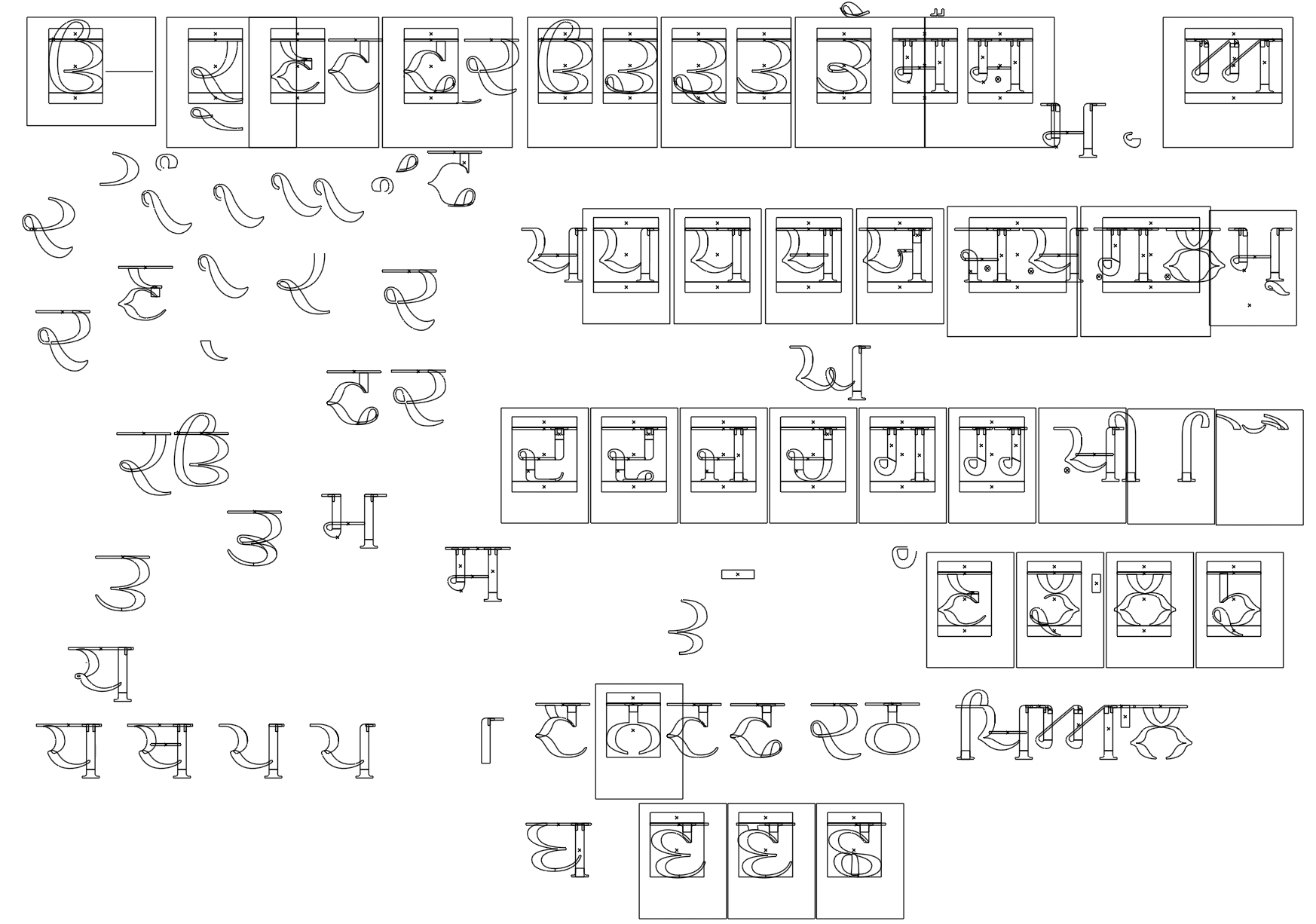
Khiyal
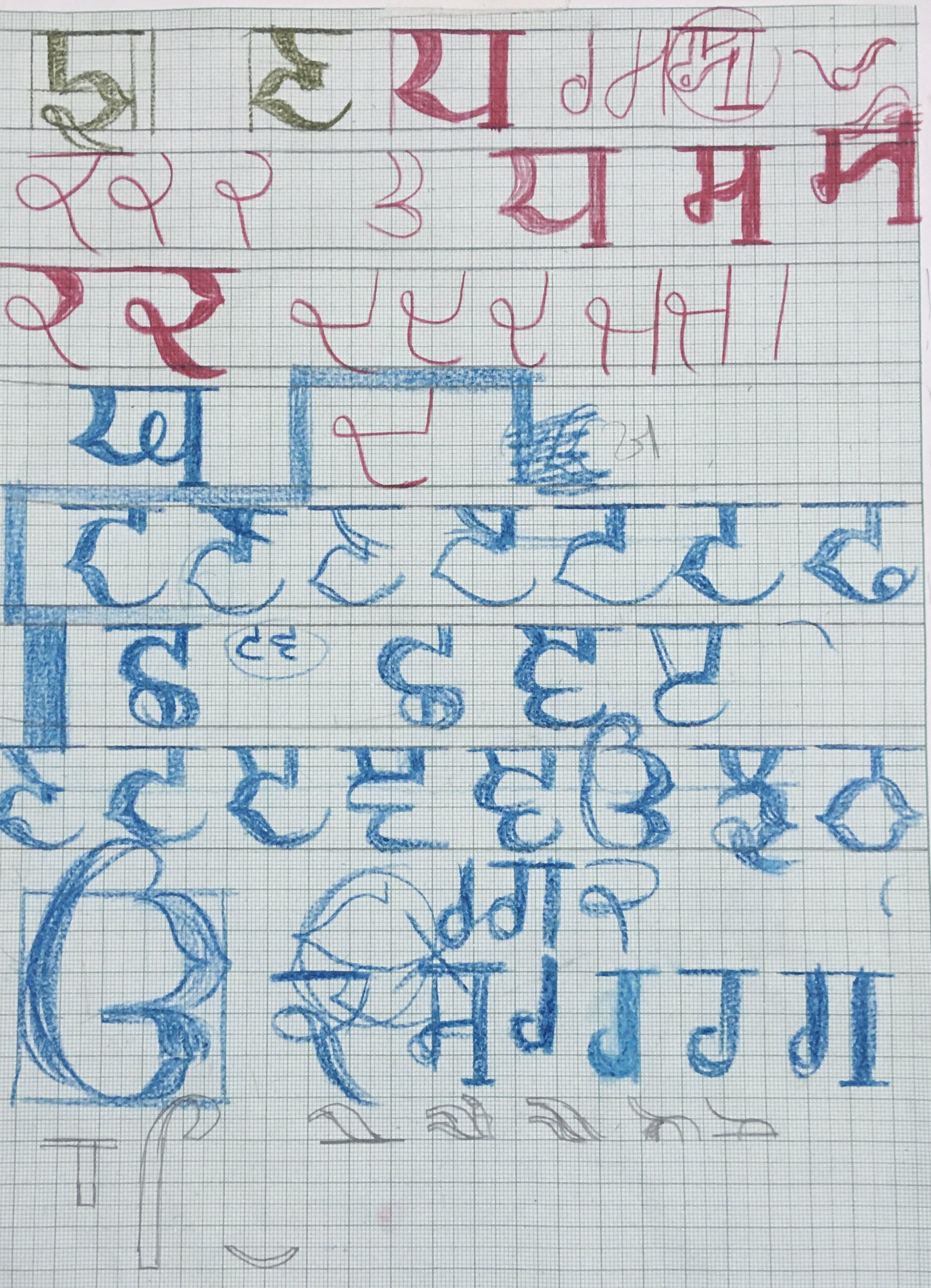
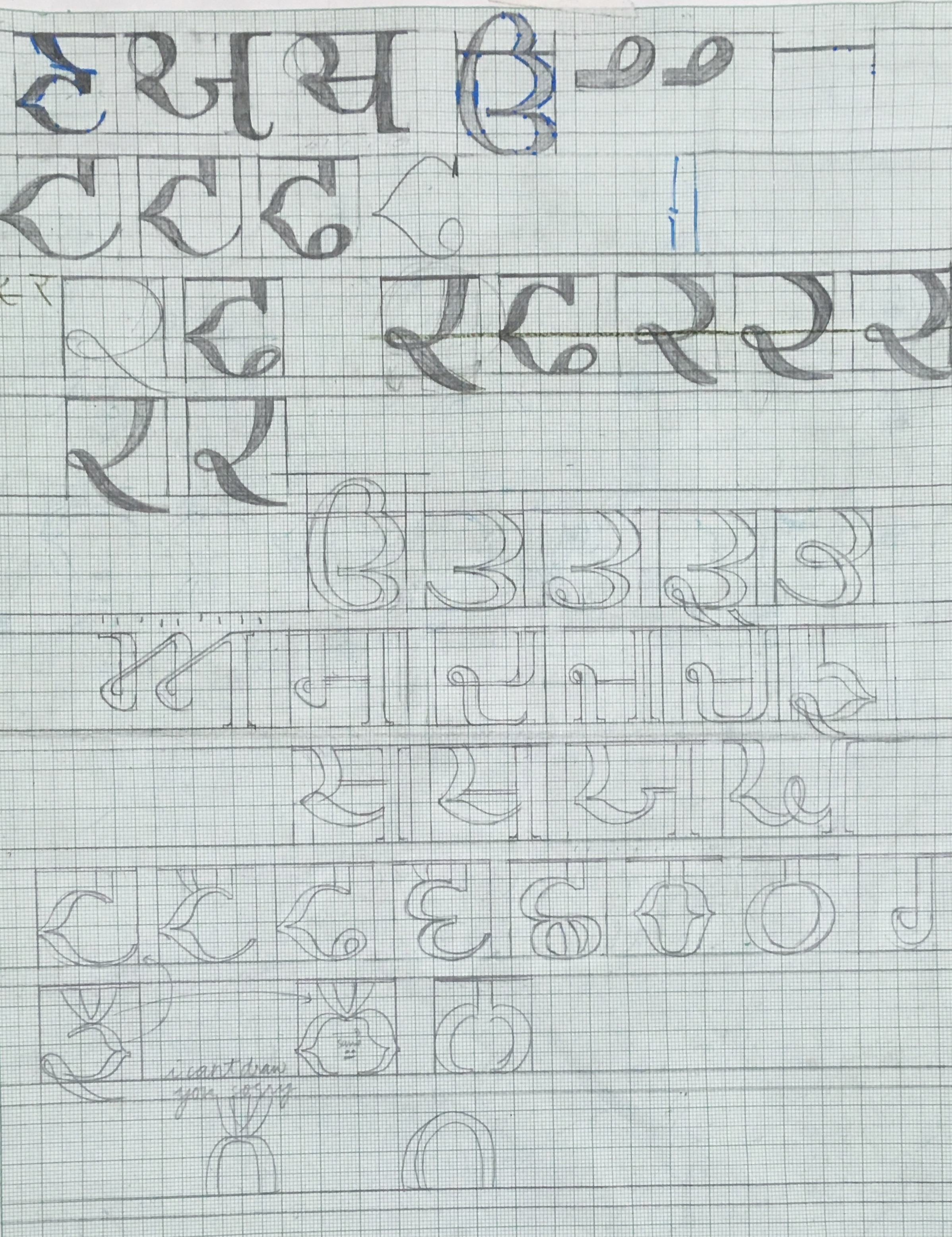
Aug 2022While studying typography in a studio project, I started to wonder, how an indic script might look with roman serifs. The indic scripts differentiate from say latin, with a major element of the ‘shirorekha’ or the line that adjoins letters from the top. Their terminals are mostly flowy and long because of its traditional calligraphic style. With Khiyal, I tried to give gurmukhi a very roman feel with serifs and contrast in the stroke width.






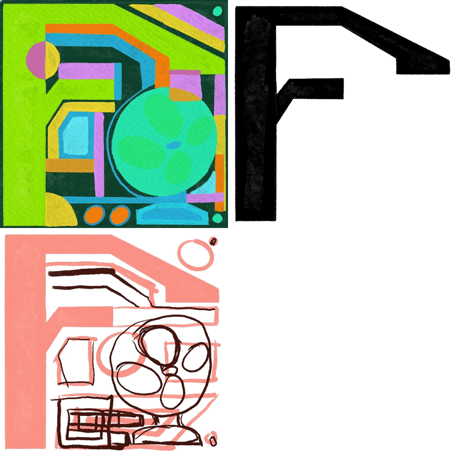
36 Days of Type (2023)
April-May 2022

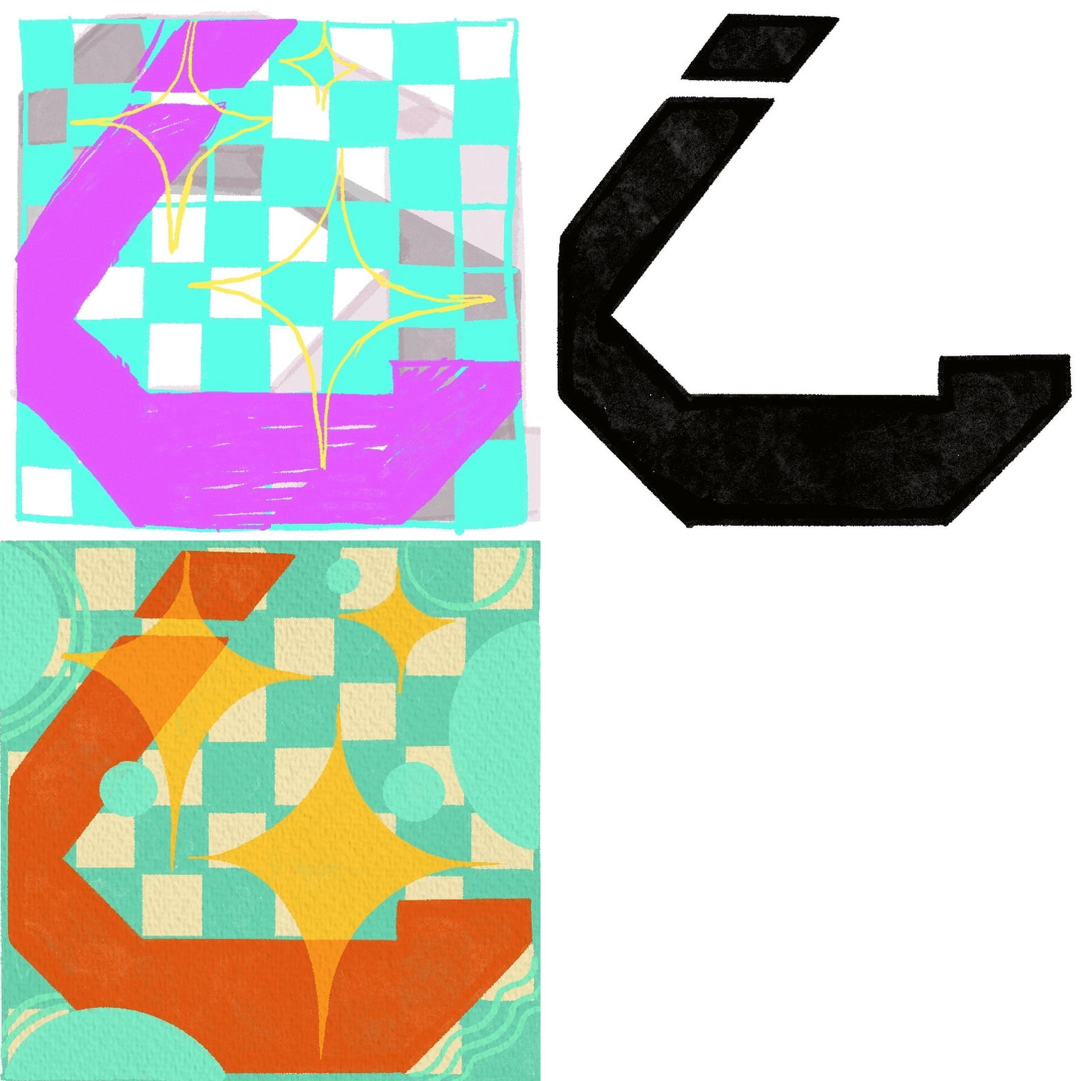
Devanagri Lino Type
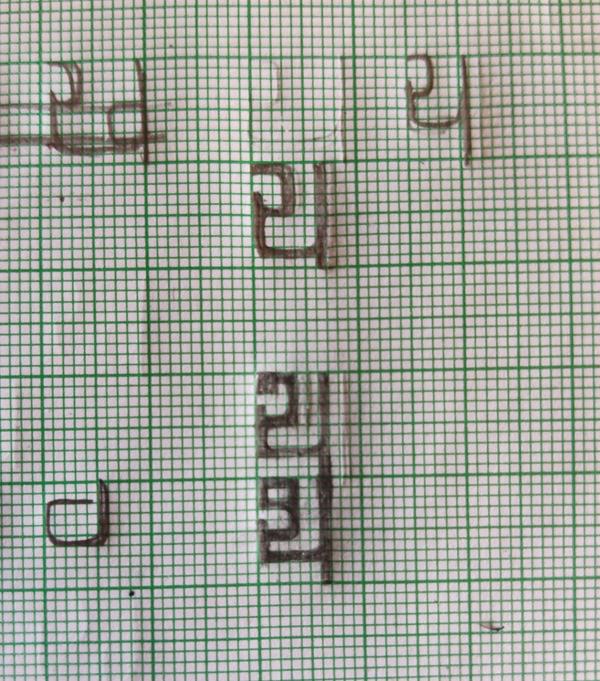
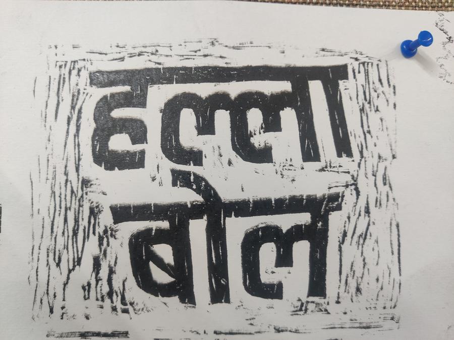
Jan 2023This attempt at a devanagri font was specifically for a project where we used graphic elements carved from Lino sheets. The features of the letters were such that could be carved easily, ie, with sharp edges and less curves. It was decided not to use this for the project.
